
SimCity Strategy Guides
 Government: Understanding Data Maps
Unlike earlier versions, SimCity has full scale graphical overlays to present important city data, rather than tiny pop-up windows. This can make it considerably easier to see what is going on in your city... provided of course you understand what the data map is trying to tell you! This article is designed for those who find all those 'colored blocks' and so on, rather confusing!
The following sections can be found in this article:
Data Map: Population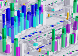
The population data map represents the number of Sims occuping a particular building at the time and their status. It can be a very busy map as often there will be multiple blocks within single buildings making it quite a confusing map to read.
This data map tracks Sims who are 'at home', working, shopping, visiting, students and homeless Sims (in parks or abandoned buildings).
The taller the block, the larger the number of Sims. The blocks will change as the day progresses, showing Sims going to work and school, shopping etc.
This map is probably less helpful than the zoning, education and tourism maps. One area it does help with is identifying clusters of homeless Sims so you can see which areas have issues with high unemployment and therefore need rezoning to create jobs.
Data Map: Happiness
The happiness data map is extremely useful for general identification of problem areas within your city and especially if you are hoping to complete one of the approval rating achievements or get all those Mayor's Mansion upgrades!
The color of the buildings ranges from green for very happy through yellow and orange to red for very unhappy.
This map makes it quick and easy to find buildings or areas with problems so you can select them and see what their complaints are. It is important when making changes to address happiness related issues, to wait for those changes to take effect before making more changes!
For more information:
Data Map: Density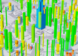
The density data map shows two sets of data, buildings are marked in white, pale blue or darker blue according to their current density level, and colored blocks ranging from red through orange and yellow to green are used to indicate how likely each building is to increase or decrease density.
Blue and pale blue buildings which show orange or red blocks have problems which will lead to them being abandoned and redeveloping as lower density buildings unless you intervene to improve their specific issues. Low density white buildings with red and orange blocks similarly also have problems which are preventing them from redeveloping into higher density buildings.
Conversely buildings which have green blocks are doing well and may redevelop to higher density. In some cases you may find they do not because there is not enough room for a larger building, or because the connecting road does not support the higher density level.
Selecting individual buildings can give you additional information, such as whether a building has enough room to grow or if a negative influence or unhappiness is causing density decay etc.
For more information:
Data Map: Residential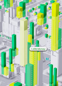
The residential data map shows blocks according to the number of units of happiness and money for all residential buildings.
In general you can expect lower income areas to have much shorter blocks than higher income areas, however considerable disparity between the two can indicate a more serious problem that needs investigating.
For example, a house that has a high wealth level, but poor happiness will probably move out soon unless whatever the source of their unhappiness is dealt with. On the flip side, a house showing very little or no money is also just as likely to move out due to unemployment, but rather than simply leaving the city, there's a good chance they will join the city's homeless population.
At a glance this map is not as useful as the happiness map, since the shorter blocks of low wealth areas do not necessarily indicate a problem that needs addressing.
For more information:
Data Map: Commercial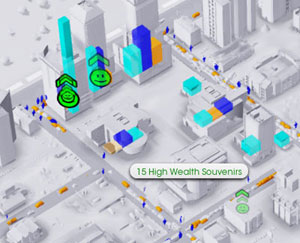
Commercial data maps show shopper and tourist activity within your city, as well as the quantity of goods and souvenirs carried by commercial buildings and the amount of profit they currently have.
This is one of the more complex maps to draw useful conclusions from, since we Mayors have no direct influence over the sale of goods, or what type of goods shops choose to sell (whilst all shops sell goods, not all shops sell souvenirs). The goods and souveniers are shown not just as a quantity, but also by the wealth level, so blocks representing goods may be marked as medium wealth merchandize or high wealth souveniers etc.
You can see where tourists and shoppers do and don't go in your city. It is helpful to see if there are gaps in your mass transit systems or areas where tourists are going to find hotels, but where there aren't casinos or attractions.
It shows where commercial areas are in trouble. Buildings with lots of goods but short profit blocks will likely go out of business. Selecting them will help determine why, for example a high wealth shopping district will soon degrade if there isn't a sufficient number of high wealth shoppers and tourists in the local area.
On the flip side, whilst high profit bars and low goods might be good for shops, they might not be good for customers and tourists. You could consider zoning some more commercial if many shops are sold out of goods and souvenirs before close of business (6pm) to avoid unsatisfied shoppers and unhappy tourists, but don't forget they will also need to be supplied by industrial zones or imports.
For more information:
Data Map: Industrial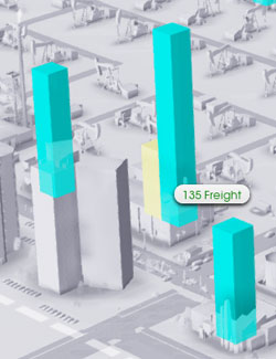
The industrial data map shows blocks representing the quantity of freight and the amount of profit each industrial building currently has.
Buildings with larger blocks of freight and lower blocks of profit are having problems and need your help. Failure to get rid of freight consistently will lead to businesses closing, slow freight production caused by lack of workers, or sick workers, will also lead to reduced profits.
Giving industrial areas with this problem a building that provides freight shipping will correct this problem. The most common solution is adding a trade depot, but most of the specialization HQ buildings along with Dr Vue's tower, will also act as a freight hub (without the need to run vehicles). Improving transport infrastructure is also important, giving industrial areas with issues access to higher capacity roads, rail and sea links etc, will help them shift their freight more efficiently.
It is worth noting that freight that goes to trade depots and HQ's makes no money for the city. It simply disappears, so having commercial districts to receive freight is always preferable to having trade depots or HQ's
For more information:
Data Map: Land Value
The land value data map shows which buildings have a positive (green) or negative (red) influence on the land value of your city. It also shows the resulting land value in pink for very low, white for low and then increasingly shades of turquoise for higher value areas.
The underlying land value will determine the wealth level of buildings that develop on top of it. A high wealth building will only develop on high value land, medium on medium etc. If a negative influence occurs in a previously good value area causing the land value to drop, buildings in that area will likely degrade to a lower wealth level.
This map can show you where buildings which are a positive or negative influence on land value are at a quick glance. Negative influences can be balanced out by adding positive influence buildings in the area, however they will make it more difficult to create higher land values overall.
It is important to keep in mind that your city will always need a mixture of land values. If you are short of low wealth workers then it may be necessary to add negative influences, or reduce the quality of local parks in a residential area to get the right sort of housing. Careful management of land values helps balance zones in local areas.
For more information:
Data Map: Power
Powered buildings are shown in yellow, unpowered areas are gray, those that should be powered, but aren't, are shown in red.
It's a pretty simple map - if you have disconnected buildings then make sure that you have enough power supply to meet your city's needs!
For more information:
Data Map: Water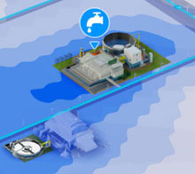
The water data map is probably one of the first you'll use when founding a city. Looking for a good supply of water is essential! This map shows areas of groundwater, the darker the blue the more water there is, dry areas are shown in white and any water pollution is shown in increasingly dark shades of brown.
Lighter blue areas are not good places to put down water pumping stations as they will quickly dry up. Areas that have heavy water pollution will require the advanced filtration pump to avoid making your Sims sick.
Keep an eye on your water map as your city grows as you can easily dry up all the ground water in your city. It is important to make sure you set up a water recycling system with your sewage treatment as soon as you can, using the water map to find a suitable location with a good water supply.
For more information:
Data Map: Sewage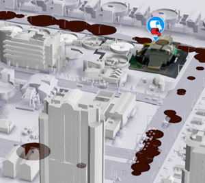
The sewage map shows where sewage flows underneath your city's streets. It also shows any problem areas where sewage processing has met its limits and sewage is flowing out into the streets and buildings (yuk).
Unless you're going for the Mayor Yuk! Achievement, you probably don't want sewage issues, so you can use this map to see quickly if your sewage processing is inadequate, or if there are isolated stretches of road network which are too far from the treatment plant (there is a critical distance beyond which power, water and sewage cannot travel down roads, so chances are those areas also have power and water issues too).
For more information:
Data Map: Tech Level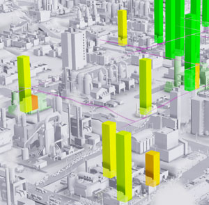
The tech level map functions in a similar way to the density map. It shows the current tech level by shading industrial buildings from white (low tech) to green (high tech), and the colored blocks (red to green) indicate the progress of the technology level of the industry.
This data map also features purple lines along roads and transport links which show the influence of technical development via the availability of skilled workers
A building with a green bar has a high technology level and, if not already a high tech industry, will probably redevelop to a higher tech level soon. A building with an orange or red bar has a degrading tech level. High tech industries which have red bars are in danger of being abandoned and spawning a lower tech, more polluting industry in its place.
Factors that can cause a decrease in the tech level of industrial buildings include insufficient skilled workers, falling educational levels in the city as well as too much garbage or pollution. Checking out the extent of the purple lines will show where your skilled workers are coming from, and will quickly show if they don't reach areas where you have failing medium or high tech industry.
For more information:
Data Map: Garbage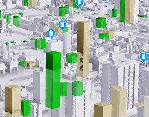
The garbage data map shows which buildings have garbage waiting to be collected (brown or red blocks) as well as recycling (green blocks).
Large blocks of garbage and recycling may not be a major problem first thing in the morning, however if there is too much garbage, the blocks will turn from brown to red. Watch them carefully as the garbage trucks roll out to make sure they get picked up before the end of the day.
Too much recycling going uncollected can also lead to problems, although they are less severe compared to too much garbage and as such the green blocks do not change color, but your Sims will start to complain about too much recycling if you don't improve your collection rate.
For more information:
Data Map: Fire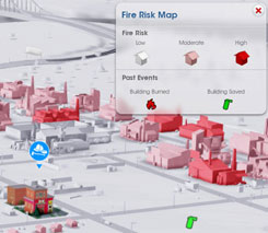
This map shows recent city fire events and whether they were successfully dealt with (a green fire extinguisher icon) or if the building burned down (a red flame icon). It also shows the fire risk of buildings within your city. White buildings have a low fire risk, red buildings have a high fire risk.
High concentrations of burned down buildings in high fire risk areas means your fire service is not coping and that SimCity's firefighters are too busy weeping over a lost shack to put out your burning industrial parks.
You may need more trucks, or another station. Having a large fire station with one or more Fire Marshals in high fire risk areas will help reduce the number of fires. Increasing the wealth and tech level of problem areas will help to reduce the number of fires. Alternatively you might find that prayer and bulldozing buildings around burning areas is more effective than any amount of investment in this incredibly useless and expensive service. I honestly do wonder just how dumb Sims have to be to have repeat visits by a Fire Marshal and yet still burn down their buildings. I'm pretty sure if someone came round and nagged me on how to not burn down my house, that I really wouldn't need them to come around again for at least another 5 years or so in order to not start playing with matches near a pan of hot oil.
For more information:
Data Map: Healthcare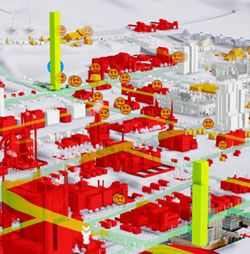
The health data map includes some of the data displayed on the germs data map, buildings which are germy are marked in red, clean buildings are in white. The heatlh map also shows recent events of sickness, injury and death, the location of your healthcare vehicles plus how many Sims are being treated (or waiting to be treated) in your healthcare system.
This map shows which areas of your city pose the greatest risks to health, so you can investigate the causes and make changes accordingly. Areas which show high injury levels are most likely low tech industrial areas, high sickness levels most likely indicates a pollution problem.
For more information:
Data Map: Crime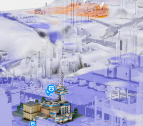
The crime map shows recent crime events as icons. It also shows the area of influence of police patrols (in blue) and criminal activity (in orange). The data map will show you also where criminals have visited from neighboring cities - not that there is a lot you can do about it other than having a lot of extra police!
Areas that are highlighted in orange where lots of crimes occur are ones with poor police coverage, conversely blue areas have good police coverage, the darker blue, the more time your patrol vehicles are spending there.
Poor coverage areas may indicate the need for more patrol cars, another police station, or perhaps a general improvement of the traffic flow in that area - patrol cars can only be effective in areas they can get to! That said, unfortunately SimCity's police are subject to not only the lure of the nearest donut shop, but also to problems caused by SimCity's terrible traffic routing, so often they can be rendered entirely ineffective by the simple presence of a three-way junction at the end of the street.
For more information:
Data Map: Education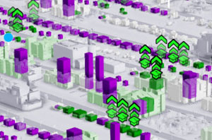
The education map highlights school bus stops plus waiting students, and displays the numbers of enrolled and not enrolled Sims that live in each building. The buildings themselves become colored green when the occupants increase their education level.
Low numbers of enrolled Sims typically means not enough buses or bus stops or insufficient classrooms. It is more likely to be too few buses or stops where you have large turquoise blocks of Sims waiting at existing stops - remember each bus can only hold 50 students!
For more information:
Data Map: Germs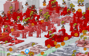
The germ data map is an important aspect of understanding health in your city. Buildings are colored according to how 'germy' they are, the darker the shade of red, the more germy they are and therefore the more likely it is that Sims who live, work or shop in that building will become sick (personally I feel the word 'toxic' may have been more informative, and provides a more rounded description of the various health hazards they have tried to convey, but huh... whatever).
Germs can be caused by air, water, ground, sewage or garbage pollution. Check the pollution data maps for buildings shown in dark red to identify the particular causes.
For more information:
Data Map: Air Pollution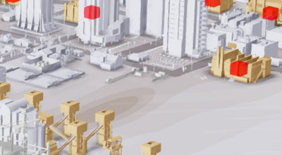
The air pollution map highlights both buildings which are the source of air pollution, and the areas of the city which are affected by air pollution.
Often areas of the city which seem like they ought to be clean (a nice suburban residential area perhaps?) but have high levels of germs and sickness, will show up as being affected by air pollution, which may be caused either by local polluting industries upwind, or worse still, air pollution from neighboring cities. This data map will show you quickly which areas are affected by air pollution which may help to narrow down the sources.
For more information:
Data Map: Ground Pollution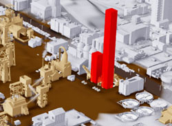
As with the air pollution map, the ground pollution data map color codes buildings according to how much ground pollution they generate. It also displays colored areas on the ground in brown to indicate areas that are affected by ground pollution.
This is another straightforward map, the darker the shade of brown, the worse the ground pollution level within an area. Low tech industry and mining are generally the worse offenders for creating ground pollution, if your city's pollution levels are sufficiently bad then you probably won't need the ground pollution map because you can see your ground pollution in normal game view as a dark brown sludge that covers the grass!
Unfortunately getting rid of ground pollution is a slow business and not as simple as getting rid of the source!
For more information:
Data Map: Wind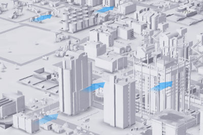
The wind data map shows the direction of the prevailing wind as arrows flowing across the city map. It also indicates the general strength of the wind at different altitudes which is helpful when choosing a location for a wind power station.
The wind direction can be used as a guide to see how pollution from industry will affect both your city, although helpfully industrial zones and polluting buildings will show a wind direction indicator when you're placing them in normal game mode. Nevertheless the speed the wind travels at also affects how quickly air pollution is both dispersed locally and carried across the region.
For more information:
Data Map: Radiation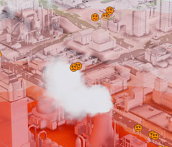
It is a good idea to check your radiation data map if you have a nuclear power station which is reporting the education level of it's workers as anything less than safe. Too many uneducated workers will result in increasing levels of radioactivity which can start to make nearby Sims sick.
If you have a nuclear meltdown then the radiation map will indicate how much of your city is affected. Since Sims cannot live or spend too much time in radioactive areas, if you want to continue playing that city, you'll need to know which areas to work around for the several hundred game years it will take for the radiation to clear!
It is also worth noting that meteor strikes can also leave patches of light radiation.
This is a very straightforward map, any amount of orange and you have radiation problems!
For more information:
Data Map: Mass Transit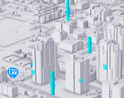
The data maps for buses, streetcars, trains and ferries all show very similar data. Each will show the location of vehicles of that type, along with turquoise blocks at terminals that indicate the numbers of waiting passengers.
The streetcar map will also show the routes where the high density avenue has been upgraded to support streetcars.
Very high turquoise blocks indicate many Sims waiting at a station or stop, if the blocks remain static for long periods of time then you may have insufficient vehicles, or possibly the vehicles are stuck in heavy traffic (sometimes I have found it is necessary to delete stops where transit vehicles have stalled or where passengers are simply not being collected, and rebuild them to get things moving again).
For more information:
Data Map: Coal, Ore & Oil
The data maps for coal, ore and oil show the density and location of these three natural resources if they are present in your city.
As you mine or drill the maps will update to show the shrinking areas of resources, although I have personally found it very difficult to completely drill an entire puddle of oil under the ground!
In addition to showing ground reserves, each map also shows blocks to show the extracted materials in storage, along with associated transport vehicles. This is a good way of monitoring your trading and supply chains to see where deliveries are being delayed. If there's a huge stack of raw material at the trade depot that imports it, but the factory that uses it is constantly running short, then possibly you need more delivery vehicles to get the material to the factory. Or possibly they're all stuck in traffic!
For more information:
Data Map: Trade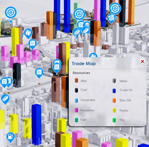
The trade data map is another colorful and sometimes hard-to-read map. It represents all tradable commodities as different colored blocks where they are stored in your city along with the locations of all associated delivery vehicles and storage depots.
The main purpose of this data map is to identify supply chain problems within your trade network, although this can be difficult to do if you are trading a wide range of commodities and therefore have a lot of different colored blocks of various sizes all over the place. I personally find that studying the resource maps is more helpful because they are less cluttered.
It is particularly important to follow the supply and demand patterns for fussy industries like the consumer electronics. If your smelting factory is demanding more ore, then it will hold up alloy production meaning your processor factory can't make processors for your computer factory! If all your delivery vehicles importing ore are stuck in traffic on the highway then perhaps bringing in the ore by rail is the answer. If there's plenty of imported ore then use the trade map to look for vehicles collecting it from the import depot to the smelting factory to see if it's factors like traffic, or simply insufficient storage space, that are causing supply problems.
For more information:
Data Map: Tourism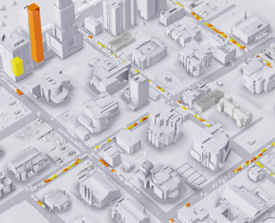
The tourism map shows the locations of tourists within your city, both on the streets and inside buildings. When inside a building they are shown as a colored block, the color indicates the wealth level of the tourists, the height of the block shows how many or how few there are inside that building.
This is a highly useful map to see how well your mass transit system is working to get tourists to where you want them to go. If there's no little highlighted tourists near your casino, event center or tourist attraction, but loads making their way out of the city past the garbage dump, then something has gone wrong!
It also shows why some casinos persistently lose money, if all your tourist traffic is going elsewhere in search of shops, hotels or simply looking for an exit then it's time to make some changes in your city!
For more information:
 Home
Home